3 ways to visualise data in Microsoft Dynamics 365 Sales
3 ways to visualise data in Microsoft Dynamics 365 Sales
June 15th, 2022
6 min read
It’s no secret that people absorb information better if it’s in a visual format (think graphs and charts) rather than just written text. This statement is backed up research, demonstrating that:
- 90% of the information transmitted to the brain is visual
- 13 milliseconds is the time taken by our brain to process an image
- Visuals are processed 60,000X faster in the brain than text
- 65% of the population are visual learners
This is where data visualisation tools have a role to play, helping our brains to process information (and often lots of it), much faster than written language. Visualising data in alternative ways can support the efficient transfer of information within a business, provide valuable insights that might have been missed otherwise, lead to increased productivity, and more.
Within Microsoft Dynamics 365 Sales, there are several ways that you can display data in a visual format. Keep reading to discover three ways below…
It is worth noting that these are just standard features, there are also add-on apps that allow you to take data visualisation a step further.
Dashboards:
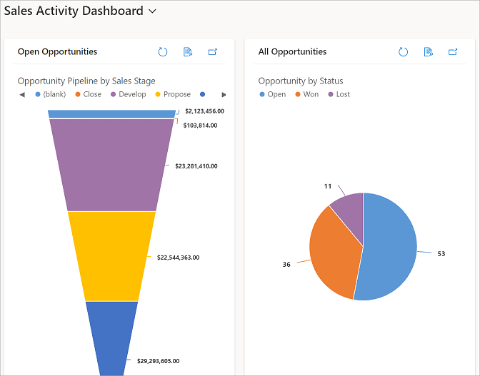
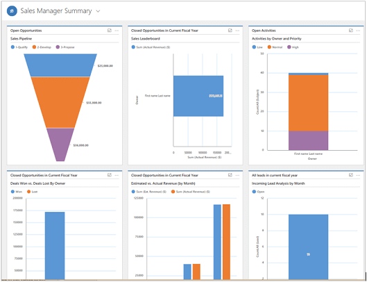
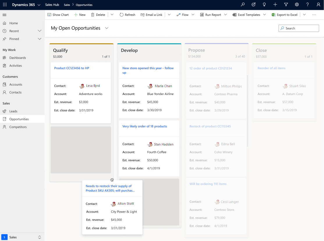
Dashboards in Dynamics 365 Sales provide an overview of your business data, using views, lists and charts, so you can quickly see important data at a glance.
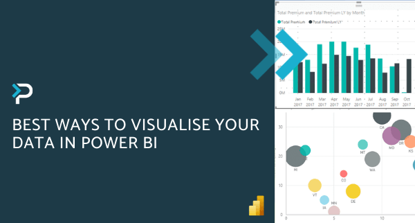
These dashboards display data such as sales pipeline, open opportunities, leads, activities, etc. What might be overwhelming in text format, is easily visible in graphs and charts, such as the ones in the image below.
There are also other types of graphs and charts available to display different types of information, such as the financial data displayed in the bar charts below.
Managers can quickly gain important insights into how their sales teams are performing by viewing the dashboard. Without these visualisations, time and effort are spent gathering information, viewing data in various formats, gaining insights, etc.
The charts displayed are also interactive, making it simple to delve deeper into the data if you wish. For example, if you click one piece of a pie graph chart, the other data streams will update to only include the records selected from the pie chart.
If you wish to take this a step further, filters can be applied to limit data to specific ranges like dates, revenue, budget, purchase timeframe, and more.
Additionally, users can create multiple dashboards that are easily accessible via the view selector. These can be created for specific roles (such as Manager or Staff level), or individuals can create their own personal dashboard to best serve their needs.
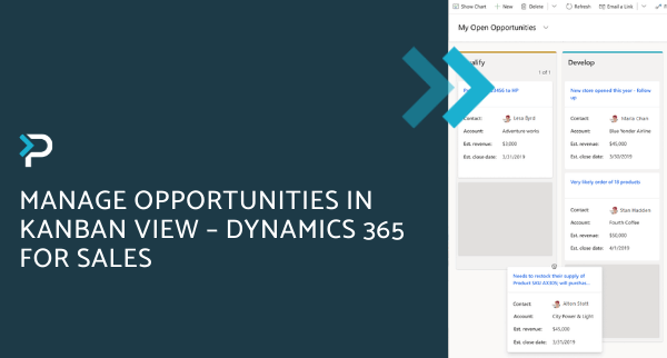
Kanban View:
Back in 2020, Microsoft released the ‘Kanban View’ for Opportunities and Activities within Dynamics 365 Sales.
Opportunities
The Kanban view allows users to monitor their pipeline and easily move opportunities between stages in the sales process.
Opportunities are displayed as cards and each column represents a different stage within the process, so users can quickly grasp where an opportunity is currently at.
To move an opportunity to the next stage, users can simply drag the card into a different column.
Activities
The Kanban view for activities helps salespeople to manage multiple activities quickly. Looking at the view, you can quickly identify the activities, and what stage they are in, and act accordingly.
Each activity is represented with cards, and the column represents the status of an activity. Simply drag activities to a different column to change their status.
Users can quickly see the key information about an activity, as this is displayed clearly on the card. The alternative view (list view) looks more overwhelming due to the layout, which may hinder productivity, particularly if you are a more visual learner.
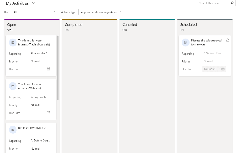
Activities Kanban view
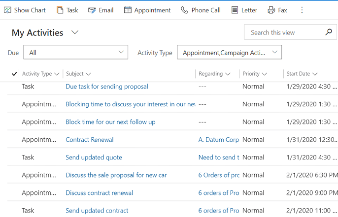
List view
Learn more about Kanban View in Dynamics 365 for Sales in our expert blog.
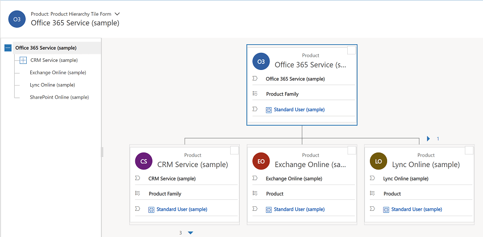
Hierarchical Relationships:
When it comes to viewing how information is related to a particular account, product or user, users can use the hierarchical view within Dynamics 365 Sales. If you wish to see more details, you can select a tile in the chart to get the full information and navigate further.
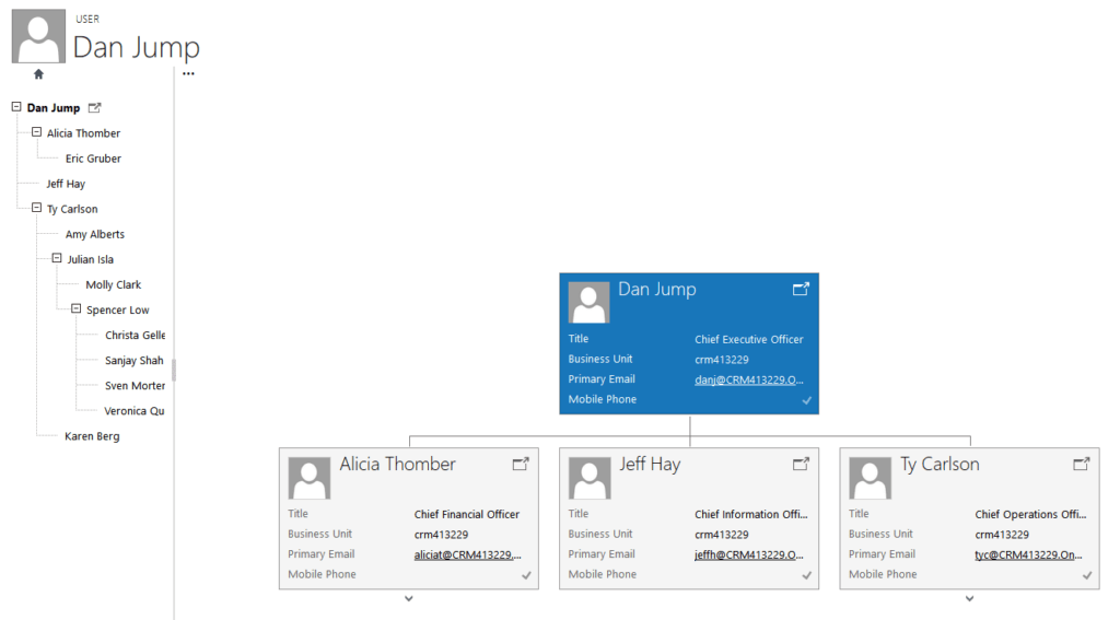
For example, from the hierarchical charts view for accounts, you can:
- See how an account is doing in overall revenue
- Drill into tiles for accounts to see where the deals are coming from and how revenue is distributed across sub-accounts
- Find out who is working an account and enlist help from others by sending email or sharing the account with other salespeople right from within the chart view
- View important details about each account, such as credit limit and latest activity posts for the account
For products, you can:
- See all the products available to sell, and how they’re related in bundles or families
- Salespeople can avoid missing a potential sale, because they can see all related products in one view
For users, you can:
- Find out who another team member’s boss is
- See who else is on someone’s their team without switching to another app
As mentioned at the start of this article, 90% of the information transmitted to the brain is visual. Therefore, having rows and rows of complex data to search through when completing your job can hinder productivity. By using some of the visualisation features listed within this blog, users can see the information they need in a simple format, navigate around data easily and ultimately, make more informed decisions.
Get in touch
If you would like more information about Microsoft Dynamics 365 Sales, please get in touch via the contact form, or email us at info@pragmatiq.co.uk / call us on 01908 038110.
Want to keep in touch?
Sign up to our newsletter for regular updates.
"*" indicates required fields