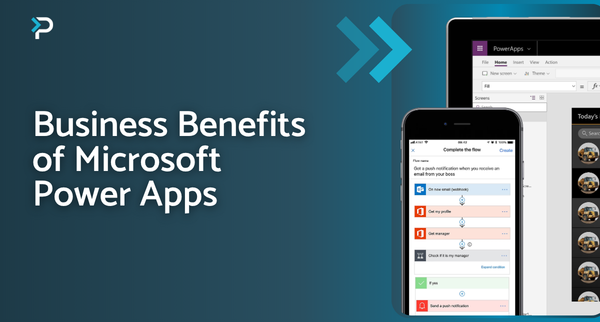
Reporting options in Microsoft Power Apps
Reporting options in Microsoft Power Apps
January 13th, 2023
6 min read
Being able to make informed, strategic business decisions is the key to success for many companies. A significant factor that influences decision-making is having access to the right data, and the insights that a company can gain from this. However, the data collection and reporting processes across many organisations are often manual, making it a time-consuming and complex process that is open to human error. Within Microsoft Power Apps, there are a variety of reporting options available that make the reporting process more efficient and accurate.
Power Apps Views
Views within Power Apps are based on a list of records and displayed in a table format. The columns in the table can be customised and are dependent on filters that are either established by the individual user or the organisation.
There are three types of views available: personal, system and public.
Personal Views
As the name suggests, these views are only visible to the user that created them. However, it is possible to share personal views with other users.
System Views
These views show key data using pre-defined filters that are set by the system administrator or system customiser role. They are visible to all standard users within the system, but they cannot be edited by them.
Public Views
These views can be freely customised, applying any desired filters and formats, and can be used in place of the system views. Additionally, it is possible to integrate these into Power App Dashboards.
Additional Features of Power Apps Views
Further Filter Options
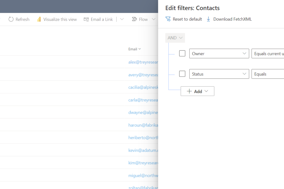
Within views, users have the capability to filter columns, without changing the already applied main filter itself. The extent of the filter options is dependent on each individual system but can range from simple alphabetical sorting to more complex options. The more complex filters are found under the ‘filter by’ option.
For example, you may have a view of phone call records called ‘Phone Calls Due this Week’, which could include the columns: Who the call is from, who the call is to, and when the call is due. Using the ‘filter by’ option, users could filter by time, location, and even add additional columns.
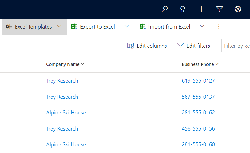
Excel and Views
Another useful feature of views is the possibility to export views as excel files. Many users are comfortable using Excel for analysis and are more familiar with the filtering interface that Excel offers. With this option, users can select the records to update, export them to Excel, make the necessary changes, and then reimport the updated file to update the data in Dynamics.
Views are a simple yet effective way of displaying data and making record details available at a single glance. Users therefore spend less time on finding data and more time on value–adding activities.
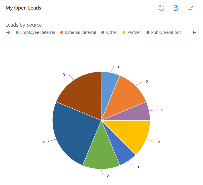
Power Apps Charts
Charts are visual representations of tables and allow users to gain a quick and easy overview of their data. They can be placed in dashboards and reports whilst also being associated with views.
Like views, there are system charts and personal charts. System charts are visible to all users, and personal ones are only available to those who created them, unless shared.
The data displayed on a chart is dynamic and therefore adjusts to any changes made within the table, ensuring that the data shown is always accurate and up to date.
There are various charts available within Power Apps, ranging from simple line graphs, pie charts, etc., to more uncommon funnel and comparison charts. The wide variety of visualisation options provides businesses with the opportunity to present data in the best possible way for them. Additionally, this is an excellent way to visualise large amounts of data but also an opportunity to easily identify trends.
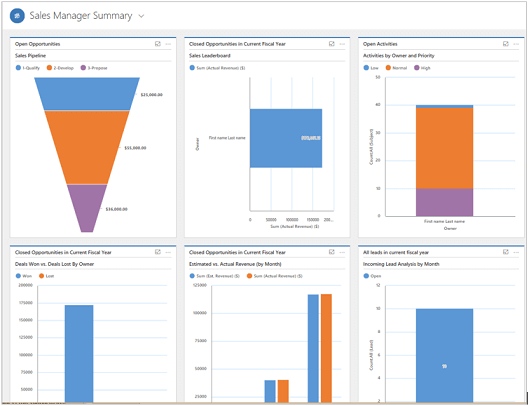
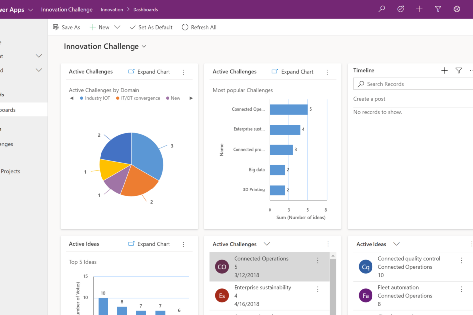
Power Apps Dashboards
Power Apps Dashboards are a collection of charts and lists placed on a single page, aimed at providing a high-level overview of a set of data.
Like charts and views, there are personal and system dashboards. Personal dashboards can be created by individual users and are only visible to them. System dashboards are created by admins or system customisers and are published to the system, available for everyone to see.
Types of Dashboards
Dashboards can also be standard or interactive, allowing users to interact with the data in different ways:
Standard Dashboards
- Shows data in the form of lists and charts
- Maximum of six components
- Users can perform limited interactions with the dashboard such as clicking on rows, opening these, etc. However, they cannot adjust filters or slice data
Interactive Dashboards
- Users can interact more directly with their data, such as setting up filters & slicers and performing more complex adjustments
- Interactive dashboards are system dashboards, and therefore cannot be created by standard users
- Can have more than six components
- Can be single or multi-stream
Both
- A limitation of dashboards is that they can only aggregate 50,000 records
Dashboards are a very useful tool that allows users to gain a quick overview of their data. Due to the highly customisable nature of them, they can be applied across a wide variety of scenarios.
Power BI Integration
Organisations can use Power BI reports in Power Apps (model-driven apps) to bring more advanced capabilities to data analysis. This allows users to aggregate data across systems and drill-down to the context of a single record.
If you have any questions about the reporting options within Power Apps, please contact us at 01908 038110, email us at info@pragmatiq.co.uk or fill out the contact form.
Want to keep in touch?
Sign up to our newsletter for regular updates.
"*" indicates required fields