Best ways to visualise your data in Power BI
Best ways to visualise your data in Power BI
August 8th, 2025
9 min read
In today’s data-driven world, organisations generate more information than ever before. But without the right tools to interpret and analyse this data, its value often goes unrealised. Power BI bridges this gap by helping businesses explore their data in meaningful ways, uncover insights, and make informed decisions with confidence.
In this blog, we break down why Power BI is such an effective tool for data visualisation and explore some of the best ways to present data within the platform.
What is Power BI?
Power BI is Microsoft’s business intelligence and data visualisation platform. It connects to multiple data sources, transforms information into interactive dashboards and reports, and helps organisations monitor performance in real time.
Designed for users of all technical levels, Power BI provides a streamlined way to turn raw data into clear, visual insights that support better decision-making across every department.
What is data visualisation and why is it important?
Data visualisation is the process of converting raw data into graphical representations such as charts, graphs, diagrams, and other visual formats. This approach helps clarify complex data sets, making them easier to understand, analyse, and derive actionable insights from.
The importance of data visualisation is summed up in the saying, “a picture speaks a thousand words.” By presenting data visually, you simplify complex information, making it more accessible and comprehensible.
Ultimately, effective data visualisation enhances decision-making. Providing a clearer view of data supports more informed, timely, and strategic business decisions.
Benefits of using Power BI for data visualisation
Using Power BI for visualisation brings several advantages:
- Improved clarity – turn complicated datasets into easy-to-understand visuals
- Faster insights – reduce time spent analysing spreadsheets and reports
- Better collaboration – share dashboards across teams to support aligned decision-making
- Enhanced accuracy – visuals update automatically when source data changes
- Stronger reporting – combine multiple data sources to create a single, consolidated view
- Scalability – suitable for small businesses through to enterprise-level reporting
These benefits make Power BI a valuable tool for organisations looking to improve the way they interpret and use their data. Discover more benefits of Power BI in our expert blog.
Is Power BI good for Data visualisation?
Absolutely.
Power BI excels at data visualisation, offering a wide array of advanced and customisable visuals tailored to diverse analytical needs. From waterfall charts and treemaps to KPI cards, Power BI makes it easy to convey complex data clearly.
Here’s how effective data visualisations in Power BI help your organisation:
- See the big picture: Identify trends and patterns you wouldn’t notice from raw numbers alone.
- Understand significance: Assess how your business is performing, what needs improvement, and where to focus resources.
- Make informed decisions: Base your choices on concrete data and tangible insights.
- Track trends over time: Establish baselines, monitor progress, and react swiftly to shifts in performance.
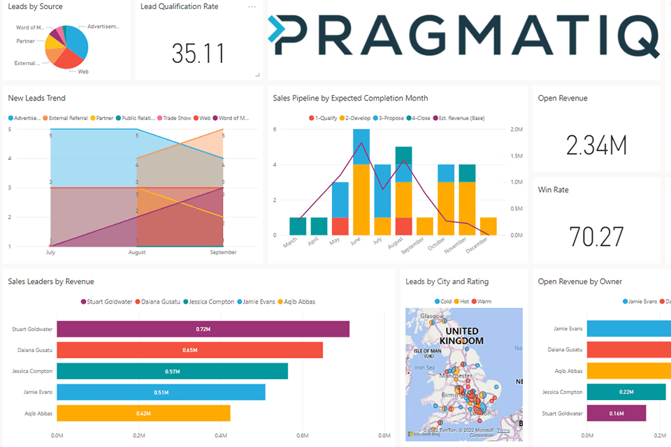
Ways to visualise data in Power BI
To get the most from your data, Power BI offers hundreds of visualisation options. Here are some of the best and most popular ways to visualise your data in Power BI:
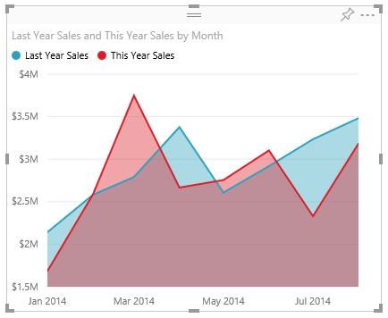
Area Charts
Area charts fill the area between a line and the axis with colour to indicate volume. They are ideal for monitoring total values across trends and comparing changes over time.
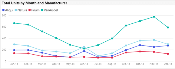
Line Charts
Line charts connect data points with a straight line and are widely used for measuring trends over periods.
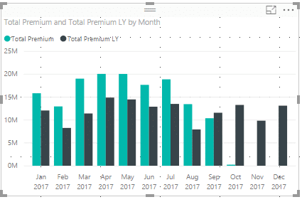
Bar Charts
Bar charts are simple to create and interpret, useful for displaying data that includes negative values by positioning bars below and above the axis.
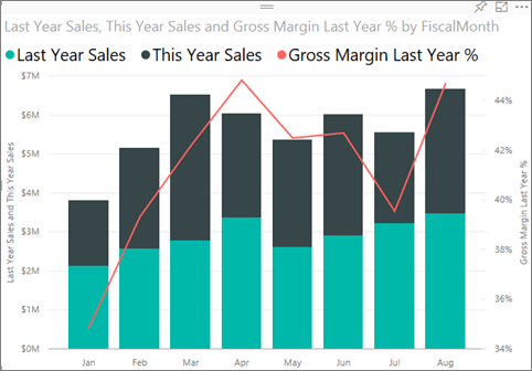
Combo Charts
Combo charts combine line and column charts into a single visualisation, enabling comparison of multiple data sets and illustrating correlations.
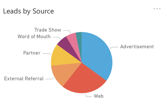
Pie Charts
Pie charts show contributions of different categories to a total, best suited for around 10 or fewer categories.
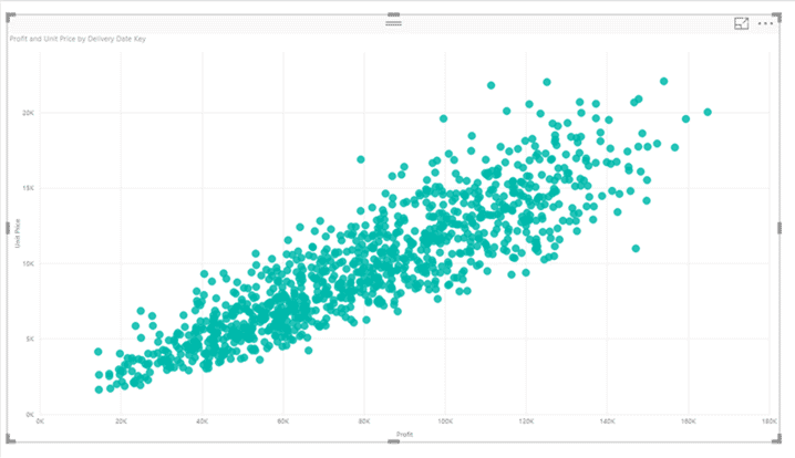
Scatter Charts
Scatter charts display relationships between two variables using dots to show correlations.
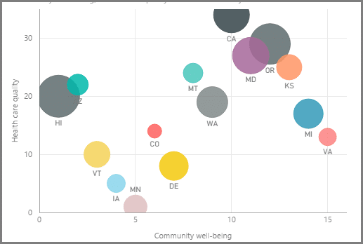
Bubble Charts
Similar to scatter charts but with an added third dimension represented by bubble size, useful for visualising three variables.
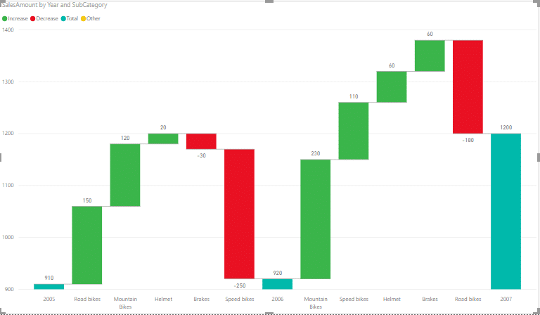
Waterfall Charts
Waterfall charts show how an initial value is affected by sequential positive and negative changes, useful for financial analyses.
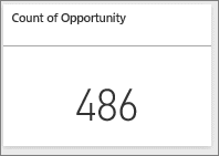
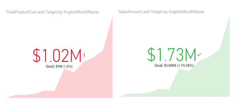
Cards
Card visuals display single figures, like total sales or profit, for quick reference. Multi-row cards can show multiple metrics at once.
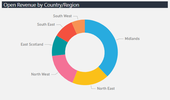
Doughnut Charts
Doughnut charts are like pie charts but with a blank centre, allowing space for labels or icons, great for category comparisons.
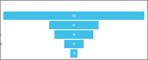
Funnel Charts
Funnel charts visualise linear processes in stages, such as sales pipelines, showing progression from leads to closed deals.
KPIs
KPI visuals track real-time progress towards targets, providing quick status updates on goals.
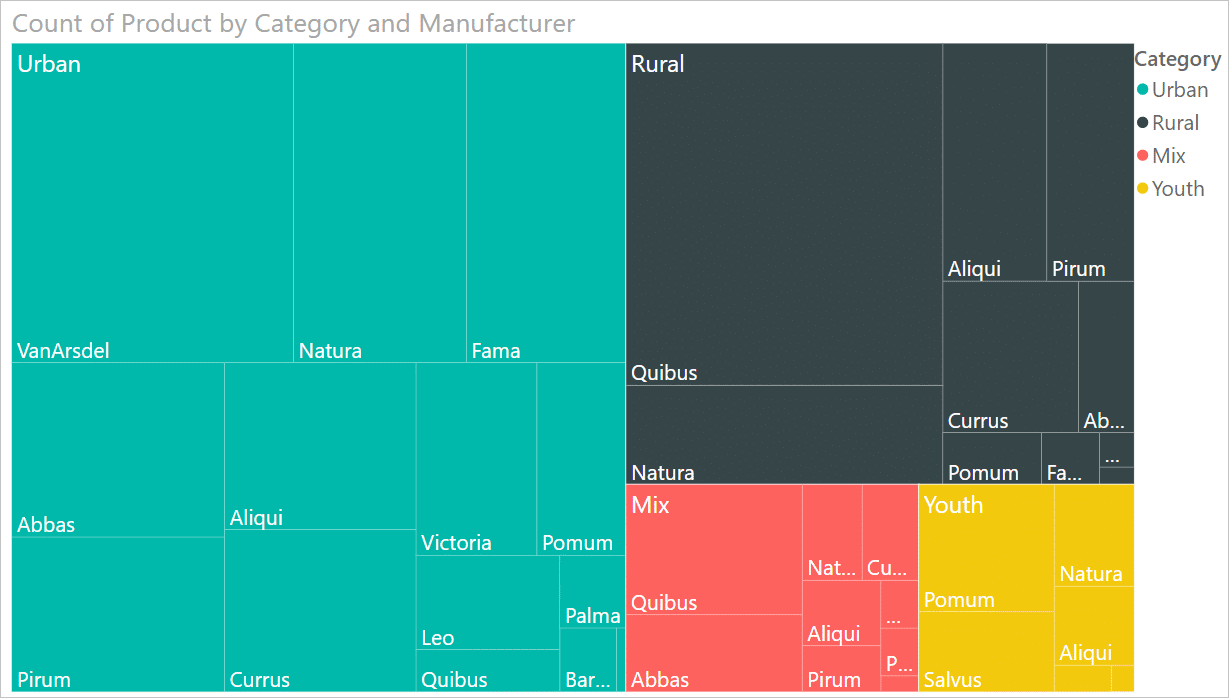
Treemaps
Treemaps use nested rectangles to display hierarchical data, making it easy to understand relationships in complex datasets.
Maps
Power BI supports several map types, including bubble maps (circles sized by data), filled maps (colour shading by region), and shape maps (region comparisons).
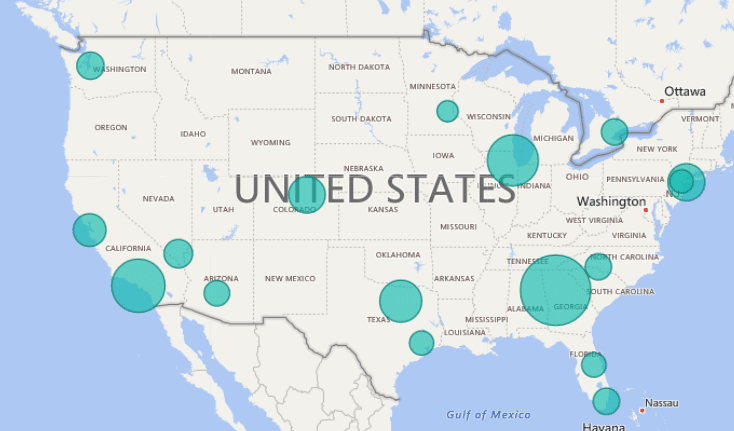
Bubble Map
Bubble maps place circles on each location, with bubble sizes representing data values. Hovering over data points reveals additional information via tooltips.
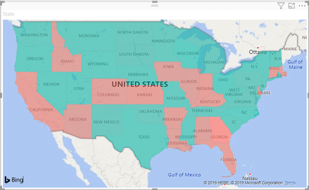
Filled Map
Filled maps use shading to display how values differ across a geography or region, providing a clear visual representation of data distribution.
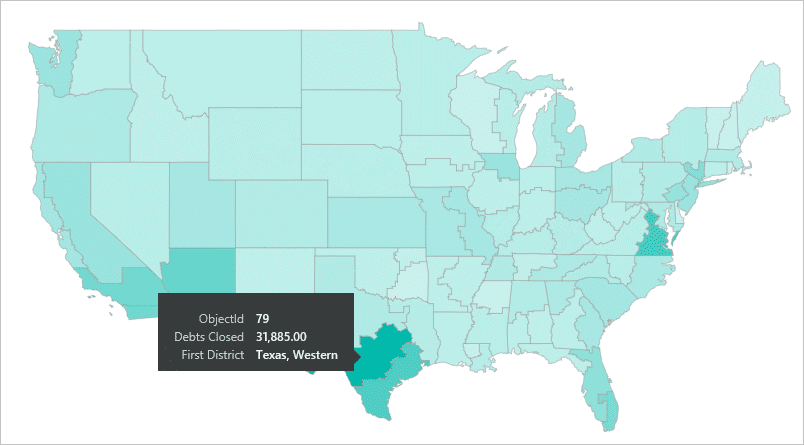
Shape Map
Shape maps show relative comparisons of regions by colouring them differently but cannot show precise geographical locations.
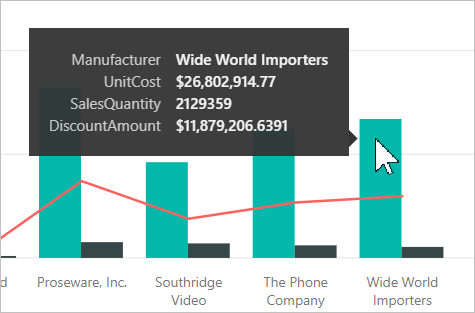
Tooltip Functionality
Tooltips add extra context to data points on hover, enabling deeper insights without cluttering visuals.
The best ways to visualise data in Power BI can include area charts, line charts, bar charts, combo charts, and KPIs. These visualisations help you see trends, compare categories, and track progress clearly, turning raw data into actionable insights. Leveraging these powerful tools can significantly improve your organisation’s decision-making process.
Get in touch
There are more visualisations available in Power BI, and you can find a full list on the Microsoft website. By exploring the popular visualisations listed in this blog, you should now have a better understanding of what Power BI is capable of and the powerful functionality it offers.
To learn more about how Power BI can help overcome reporting challenges within your business read our blog or check out our Power BI webinar to the solution in action.
As a Microsoft Partner, we implement Power BI across the majority of our projects to help our clients gain clarity around reporting and uncover actionable insights from their data. If you would like more information, please get in touch via the contact form, or email us at info@pragmatiq.co.uk / call us on 01908 038110.
Want to keep in touch?
Sign up to our newsletter for regular updates.
"*" indicates required fields