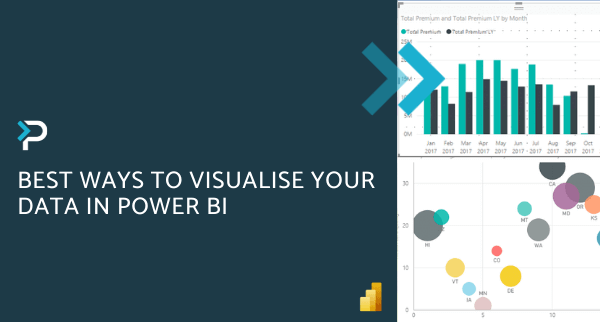
Top 10 Tips for Designing Power BI Dashboards
Top 10 Tips for Designing Power BI Dashboards
March 20th, 2025
7 min read
Power BI is Microsoft’s powerful analytics and reporting tool, enabling users to drill down into their data to gain deeper insights and therefore make more informed decisions. This data is displayed in reports and dashboards, so users can easily see the metrics they need at a glance.
Power BI dashboards are ideal for decision-makers who want to keep track of KPIs, identify trends, and respond quickly to changes — whether they’re executives reviewing high-level metrics or team leads monitoring performance.
Within Power BI, there is a myriad of features available that can be used to make your reports more engaging and visually pleasing, as well as deliver all the information you need. Within this blog post, we talk you through our top tips for designing sleek and eye-catching Power BI dashboards…
What’s the difference between a Power BI dashboard and a report?
It’s easy to confuse dashboards and reports in Power BI, but they serve different purposes:
- Dashboards offer a high-level view, typically made up of visuals pinned from multiple reports and datasets. They’re ideal for monitoring key data points at a glance.
- Reports, on the other hand, are more detailed, interactive, and often focused on a single dataset. They allow users to drill down into specifics and analyse data more deeply.
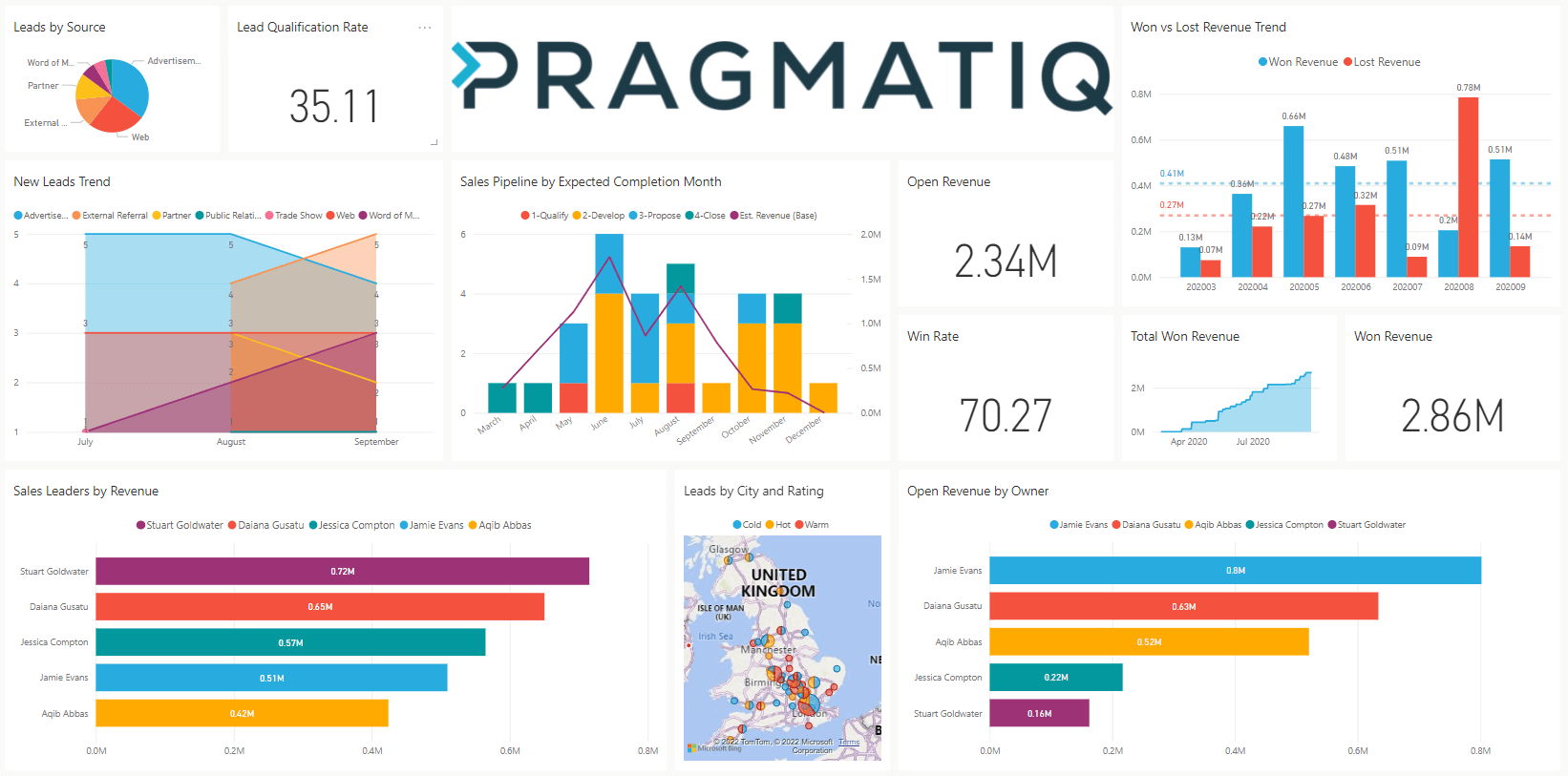
Types of dashboards in Power BI
The type of dashboard you create will depend on your audience and business needs. Examples include:
- Executive dashboards: Provide an overview of business performance and KPIs
- Operational dashboards: Focus on live data for day-to-day monitoring
- Department-specific dashboards: Tailored to Sales, Marketing, Finance, HR, etc.
- and more…
How to design a good Power BI dashboard — quick checklist
- Define the purpose: What key insights should the dashboard deliver?
- Know your audience: Tailor content and complexity to their needs and expertise.
- Keep it simple: Focus on essential metrics to avoid clutter and confusion.
- Use consistent colours and fonts: Ensure readability and visual harmony.
- Organise logically: Place the most important information top-left, with supporting details following.
- Choose the right visuals: Match charts and graphs to the type of data and audience.
- Make it interactive: Add slicers, tooltips, and bookmarks to enhance usability.
- Optimise for devices: Design for the screens your users will most often use.
- Test and refine: Gather feedback and iterate to improve clarity and usefulness.
10 Tips for Designing Power BI Dashboards
1. Consider your audience
When designing your dashboard consider your audience – what information will help them to make successful decisions? How will the dashboard be used and by who? Dashboards are a way to summarise your data — your users can always dig into the reports for more detail.
You should also consider the device your readers will be viewing the dashboard from. If it is part of a large presentation on a big screen, you can include more content, but if it will be viewed on tablets or desktops, a dashboard with fewer tiles will be easier to read.
2. Avoid over-complicating the dashboard
Dashboards provide a single place to view your key data at a glance. Best practice is to display all tiles on one screen and avoid scroll bars. Stick to what’s essential so users can act quickly and confidently.
3. Use a theme
A theme can only be implemented within the desktop app, but once it has been set, it can be saved for future use. A consistent theme saves time, improves readability, and ensures visual consistency across all reports.
4. Utilise full-screen mode
When presenting your dashboard, ensure your dashboard is displayed in full-screen mode to avoid distractions.
5. Think about page layout
Most people read from left to right so consider this when placing your data. Keep your most important information in the top left corner, gradually working down to more detailed data.
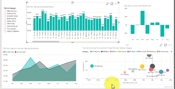
6. Use the right visualisation for the data
The visualisations you use should be easy to read and interpret; charts are good for numbers, whereas cards make your key data stand out. We asked our Technical Consultant and Power BI Expert, Nick Metcalfe, for his top tips when selecting and using Power BI visualisations:
- Explore the visualisations – Use a variety of visualisations and explore the App source to access new visualisations to freshen up your reports
- Format your visualisations – Decide on a format for your visualisations (background colour, header colour, fonts and font sizes) and then stick with this across the dashboard for a uniform and professional look
- Circular charts – Be aware of when to use pie, donut or other circular charts. These types of visualisations are best if there are fewer than eight categories as it is harder to compare values in a circle in comparison to a bar or column chart
- Be consistent with chart scale – Ensure you maintain consistency with chart scale on axes, chart dimensions and the colours you use for values
- Don’t mix your measures – Whether it’s timescales or quantities, don’t mix measures on the same scale
7. Use slicers
Though you can achieve the same functionality via the filter pane, adding slicers to the report can improve the look and ease of use of the report. Try different types of slicers, drop down, list, sliders, etc.
Top tip from Nick: There are two ways to display list slicers – horizontal and vertical. Try both and see which looks best.
8. Utilise bookmarks
If your page is looking too full, try using bookmarks and buttons to show and hide visualisations. This helps maintain a clean design while still providing access to more detailed insights.
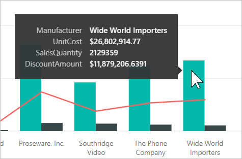
9. Use tooltips
No matter how good your dashboard looks, some of the data can be meaningless without context. You can use ‘tooltips’ to quickly provide the necessary context and allow users to drill down further into the information, with just one click. We recommend keeping the dashboard more high-level and adding tooltips to provide the additional detail, without taking up space.
10. Experiment with different things
Despite the tips we have suggested, don’t be afraid to experiment and try different things. Try moving where the header is displayed, test where you put slicers but implementing it on a small area first, play around the with the page orientation, or change the layout of the visualisations – the possibilities are endless!
How to create a Power BI dashboard
Once your reports are ready, here’s a quick summary of how to build a dashboard in Power BI:
- Open the Power BI Service (online)
- Go to the report you want to use and pin visuals to a new or existing dashboard
- Use the dashboard editor to resize, reposition and organise your tiles
- Add interactivity with slicers, tooltips and buttons
- Save and share your dashboard with relevant stakeholders
Dashboards can pull visuals from multiple datasets and reports — great for summarising data across departments or business units. For more complex Power BI projects you can get in touch with a Microsoft Partner like Pragmatiq who can help.
Get in Touch
If you would like more information about Microsoft Power BI you can check our Power BI Guide, alternatively you can get in touch by emailing us at info@pragmatiq.co.uk, or calling us on 01908 038110.
Want to keep in touch?
Sign up to our newsletter for regular updates.
"*" indicates required fields